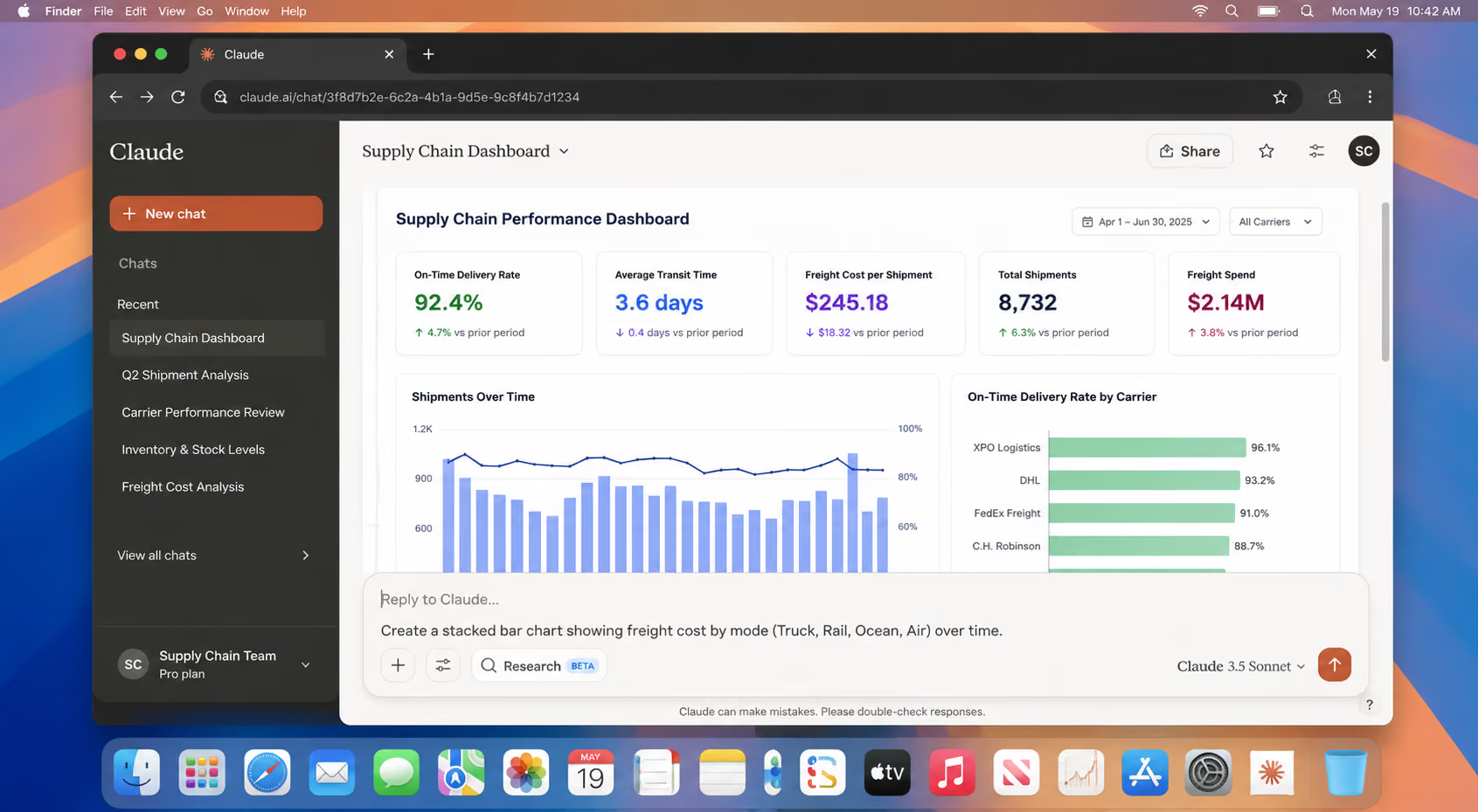



Supply chain and logistics management teams run on spreadsheets, and those spreadsheets get huge. A file tracking shipments and freight across a dozen suppliers can hit tens of thousands of rows in a few months, and nobody can read that at a glance. The usual way to get a dashboard out of it takes hours of manual pivot tables and copy-pasted charts every reporting cycle.
Claude cuts that to a few minutes. The user uploads the spreadsheet, describes the dashboard they want in plain English, and Claude builds a working one with live charts and filters. This guide covers the exact Claude prompts for the job, from the first upload to a report the user can hand their team.
#ProTip: Users new to these tools might start with our guide on how AI assistants work first.
What Claude Can Do With a Spreadsheet
Before diving in, the user should be clear on what this tool can and can't do, because it can save a lot of misplaced effort. Claude’s can:
- Read Excel and CSV files the user uploads
- Audit the data and report what's in it, including the problems
- Calculate metrics and build the pivots the user would otherwise do by hand
- Generate an interactive dashboard as an Artifact, with KPI cards, charts, filters, and tables, all running in the browser
- Rewrite that dashboard as many times as needed, from plain-language feedback
There's a real limit, though. The dashboard Claude builds is a snapshot of the file the user gave it. It doesn't plug into the ERP or the TMS, and it won't refresh on its own overnight. For a monthly review, a one-off analysis, or a prototype a user wants to put in front of a stakeholder before anyone commits engineering time, it's fast and genuinely useful.
For a live dashboard that two hundred people load every morning, a dedicated BI platform is the better option. In any supply chain management workflow, the user should work out which of those two jobs they're facing before anything else. It keeps expectations realistic, and it shapes their very first Claude prompt.
Preparing Supply Chain Spreadsheets for Claude
A few minutes of prep makes everything downstream easier. Ideally, the file holds one dataset, or at least keeps the tabs separated cleanly so it's obvious what belongs to what. It should have a proper header row rather than a title banner sitting above the columns.
Consistent date formats help, though Claude can fix those if they're a mess. And the user should have a rough idea of the question they actually want answered, because "build me a dashboard" produces something far more generic than "show me which carriers are missing delivery windows and where."
Good supply chain management reporting starts from a real question, and the data follows. If any columns hold genuinely sensitive information, there's a section on handling that further down.
How to Build Dashboards from Supply Chain Spreadsheets Using Claude Prompts
Here are the six steps users need to follow, as well as Claude prompt templates for supply chain professionals to copy-paste from.
Step 1: Have Claude read the file before it builds anything
A common mistake is asking for the dashboard in the very first message. Better to have Claude audit the data first, so problems surface before they get baked into a chart.
Two things come out of this. The user finds out whether the file contains what they assumed it did, which isn't always the case with a spreadsheet that's been passed around for two years. And they get a list of the messes to clean before any of it reaches a visual. It's the least glamorous step and the one that saves the most rework.
Step 2: Decide what the dashboard should actually measure
A dashboard is only as good as the metrics on it. A user who already knows their KPIs can move on. For anyone unsure which ones belong on a single screen, Claude can propose a sensible set based on what's in the file.
For most logistics management reporting, the usual candidates look something like this.
The user picks the handful that map to a decision someone on the team actually makes. A metric nobody acts on is decoration.
Step 3: Clean the data
Now the user fixes what Step 1 turned up. The prompt should be specific about what needs doing, and it should ask for a summary of the changes so nothing happens silently.
The user should keep the original file untouched somewhere. It's the only way to check Claude's cleaning against the raw data, and it stops cleaning decisions from quietly overwriting records they might need later.
Step 4: Write the Claude prompt that builds the dashboard
This is the prompt that does the real work, and a good one is specific about four things: which metrics go where, what chart each one gets, what a reader can filter or sort, and how the whole thing should look.
Here's a full example the user can adapt to their own columns.
Claude builds this as an Artifact that appears beside the chat, so the user can watch it render, click into the filters, and sort the table straight away. If something's off, they tell Claude what to change and it rebuilds from there.
Step 5: Iterate in plain language
The first version is rarely the last, and this is where a Claude prompt beats wrestling with formulas. Because Claude holds the context of the data and the last request, the user describes the change and nothing else.
A few examples of the kind of follow-up that works:
- "The freight cost chart is cluttered with twelve carriers. Group everything outside the top six into an 'Other' bar."
- "Add a horizontal line at 90% on the on-time chart so I can see when we drop below target."
- "Change the late threshold from two days to three."
- "Make the KPI cards show the change against the previous period, with an up or down arrow."
Each of those is one sentence, and each produces a new version of the dashboard without the user re-explaining a single column. That loop, describe and revise, is most of what makes this quick.
Step 6: Reuse it next cycle
For anything recurring, the user saves the build prompt from Step 4. Next month, they upload the fresh file, paste the same instructions, and get the same dashboard on new numbers in about a minute.
Better still, the whole thing lives in a Project. The metric definitions, the cleaning rules, and the formatting preferences are all stored in the same place, so each cycle the user supplies the new data and skips the setup entirely. Projects are on the Claude free plan now, which makes this a practical habit rather than a paid luxury. For more on building repeatable habits like this, our guide to using AI for productivity covers the wider picture.
How to handle Sensitive Data in Claude
Supply chain files often contain information a user would rather not hand over casually, like supplier pricing, contract terms, customer details, internal margins. A little deliberateness goes a long way here.
On consumer plans, the user should check their data settings, since Anthropic offers controls over whether conversations are used for training. For regulated or highly sensitive data, an enterprise agreement with the right terms is the safer route, as is working from anonymized or aggregated extracts rather than the raw source.
And the simplest habit of all is to strip the columns the dashboard doesn't need before uploading. If the dashboard doesn't need supplier bank details, they should be left out of the file entirely.
Limitations of a Claude Dashboard
The dashboard is good at showing where the problems are. It can flag that one carrier missed forty percent of its northeast windows last month, or that lead times from a particular supplier have crept up week on week. The dashboard can't fix any of it, though.
That work is logistics coordination, and logistics coordination happens over email. Someone has to message the carrier about the missed windows, chase the supplier on the slipping lead time, escalate internally when a shipment is about to blow a customer commitment, and keep that customer updated while it's sorted. A logistics team can spend more of its day inside the inbox than inside any dashboard, and that's the part no chart resolves.
Using an Email-Native Coordination Layer to Overcome Claude Shortcomings
A dashboard built from these steps will surface real problems fast: a carrier's slipping windows, a supplier's lead time drifting out. But a chart doesn't email the carrier, and it doesn't draft the note asking the supplier what changed. That work still has to happen somewhere, and for most logistics teams, it happens in an inbox that's already overflowing.
This is the gap between problem and execution, and it's where a tool built for email earns its place next to one built for analysis.
Gmelius turns a shared Gmail inbox into something a logistics team can run coordination from. Meli, the AI built into Gmelius, drafts replies from the actual email in front of it, so a carrier follow-up or a supplier chase starts from the real context rather than a blank page. It handles triage automatically, routing and tagging incoming mail by carrier or shipment and getting it to the right coordinator.
While Claude helps the user see what's going wrong in the data, Meli helps their team work through the email that puts it right. For a user weighing up tools for the communication side of logistics management, our comparison of AI email assistants and this look at what AI agents actually do both cover that side in more depth.
Ready to close the loop between your dashboard and your inbox?
Start your free Gmelius trial and put Meli to work on the logistics coordination your reports keep surfacing.
FAQs
What's the best Claude prompt to start with?
The audit prompt from Step 1, every time. When the user asks Claude to summarize the file and flag its data quality problems first, they catch issues early and find out whether the spreadsheet even holds what they think it does. Go straight to "build me a dashboard" and errors end up inside the charts.
Is a paid Claude plan required to build a dashboard from a spreadsheet?
No. File uploads and Ar tifacts, which are the two features this workflow depends on, are available on the free plan. A user may hit usage limits on a long session with a large file, and heavier or repeated work is more comfortable on a paid plan, but a single dashboard from a reasonable spreadsheet sits well within free-tier reach.
How large a spreadsheet can Claude handle?
Larger than most people expect, though there's a ceiling. For very big files, tens of thousands of rows across many columns, it helps to trim to the columns the dashboard needs before uploading, or to hand over an aggregated extract rather than every transaction. If a file is genuinely enormous, the user is better off summarizing or sampling it first and building the dashboard on that.
Can I upload multiple files or spreadsheet tabs at once?
Yes. A single Claude.ai conversation accepts up to 20 files, and a workbook with several tabs counts as one file, so there's no extra tab limit to worry about. The practical ceiling is less about the count and more about size: several large files together can eat into how much Claude can hold in view at once, so for genuinely huge datasets it still helps to trim to the columns needed, or split very large files rather than uploading everything at full size.
Can Claude connect the dashboard to a live ERP or TMS?
Not directly. The dashboard is built from the file the user uploads, so it reflects that snapshot rather than a live feed. For recurring reporting, the practical pattern is to export fresh data each cycle and rebuild from a saved prompt. For a genuinely live dashboard tied into internal systems, a dedicated BI tool is the right destination, and Claude is still useful for prototyping it first.
Is it safe to upload supply chain data to Claude?
It depends on the data and the plan. On consumer plans, the user should review their training-data settings, consider an enterprise agreement for regulated or highly sensitive information, and get into the habit of stripping columns the dashboard doesn't need before uploading. Sound data handling matters as much in supply chain management as any dashboard built on top of it.




.avif)

.avif)